
Most People End Up With Wall Art That's Too Small — Here's How to Avoid It


I get this message often. Someone found an image they loved, took their time deciding, ordered a 16×24 — and a few weeks later they’re writing to ask whether that same photograph comes larger.
It usually does. But how does this keep happening? It’s rarely a matter of taste. Judging scale against a bare wall is difficult for almost anyone, and everything about the way you shop for a print works against you.
Here’s where it goes wrong, and how to avoid it.
Your screen is lying to you
Whatever you’re reading this on — phone, laptop, tablet — is showing you every photograph at exactly one size. Palm-sized. A sweeping 40-inch panoramic and a modest 8×12 are indistinguishable as you scroll past them.
Then you try to imagine one of them on your wall, and the only reference point your brain has is that little rectangle in your hand. The mental picture is built from the wrong raw material.
That’s it. That’s the source of nearly every sizing regret I hear about.
Which means the solution isn’t thinking harder about it. It’s putting something real on the wall before you commit.
Start with shape, not size
Before you think about how big, work out what shape your wall wants. This is the step most people skip, and it quietly limits everything that comes after.
Photographs come in proportions — the relationship of width to height — and those proportions don’t stretch. A wide panoramic and a standard horizontal are different objects, not the same object at different sizes.
A rough guide to what goes where:
Standard horizontal (roughly 3:2 or 4:5) — the workhorse. Above a sofa, a bed, a console table, a desk. Most of my mountain and lake images live here.
Vertical — narrow walls, the space between two windows, the wall at the end of a hallway, either side of a fireplace. Verticals also help a room with low ceilings feel taller. Most people under-buy verticals because they’re harder to picture, but a tall image in a narrow space does something no horizontal can.
Panoramic — long, low walls. Above a long credenza, up a staircase, along a hallway, above a headboard on a wide wall. A panoramic is the one format that reliably makes a room feel wider, and it’s the format most people never consider until they see one hanging.
If your wall is wide and short, no amount of choosing the perfect size will make a vertical work there. Shape first.
Then go bigger than feels comfortable
Here’s the directional advice, and it’s almost universally true: whatever size you’re leaning toward, the next one up is probably right.
Art above furniture should relate to that furniture’s width — spanning most of it, not a third of it. A small print floating above an 84-inch sofa reads as an accident. It doesn’t look modest or restrained; it looks like something got left behind during a move.
This is where the actual numbers matter, and it’s why I built a printable guide with a lookup table — you find your furniture width, you read across, you get your size. There’s a link to it further down.
The tape test — and how to do it properly
Everyone says to outline the size on your wall with painter’s tape. It’s good advice that most people execute badly.
A taped rectangle shows you the footprint but not the mass. An empty outline reads smaller than a filled one, because your eye keeps seeing the wall through it. You’ll look at a correctly-sized outline and think it’s too big.
Do it this way instead:
- Tape newspaper, kraft paper, or a cut-down cardboard box into a solid rectangle at the size you’re considering. Solid, not an outline.
- Put it on the wall at the height you’d actually hang the piece. Height changes the read considerably — a print hung too high looks smaller and more disconnected than the same print hung correctly.
- Leave it up for two or three days. This is the step that matters most and the one everybody skips. Walk past it. See it in morning light and lamplight. Look at it from the doorway, not just from three feet away.
First reactions to scale are unreliable. Three-day reactions are trustworthy. And in my experience, the mock-up that felt slightly too big on day one almost always feels right by day three.
Factor in viewing distance
A print in a hallway gets seen from four feet away. A print above a sofa gets seen from twelve feet across a room. Those are different jobs and they want different sizes.
Close-range spaces — hallways, powder rooms, stairwells, a reading nook — can carry smaller prints well, because you’re near enough to read the detail. That’s where an intimate image rewards you: the texture in a granite face, the structure inside a reflection.
Distance spaces — living rooms, dining rooms, open-plan areas, lobbies — need scale, or the image simply stops registering. From across a room, a small print becomes a smudge of color. The photograph you chose for its detail is a photograph nobody is standing close enough to see.
If a room has both, that’s a reasonable argument for one large piece rather than several small ones.
Framing changes the size
The dimension on the product page is the image, not the finished object. Framing adds to the footprint, sometimes considerably.
A matted and framed paper print grows in every direction — the mat width doubled, plus the frame moulding. It’s easy to add several inches to both height and width, which is enough to matter on a tight wall between two windows.
Canvas, metal, and acrylic in a float frame add much less, because there’s no mat and the moulding is slim. If you’re working with limited wall space, or you want the largest possible image for the space you’ve got, these formats give you more picture per inch of wall.
Before you order, measure your usable wall space, then check whether you’re measuring the image or the finished piece. If you’re not sure with something in my collection, ask me and I’ll give you the finished dimensions.
When one big piece beats three small ones
Groupings can be beautiful, but they’re harder than they look. Multiple pieces need consistent spacing, a shared alignment, and enough visual relationship to read as one composition rather than three unrelated decisions.
A single large photograph is more forgiving, and usually more striking. If you’re uncertain, one piece at a generous size is the safer choice — and it’s the choice that most often produces the “I can’t stop looking at it” reaction I hear about after the fact.
Where groupings genuinely earn their place: long hallways, wide staircase walls, and pairs flanking something architectural like a fireplace or a doorway.
Get the printable guide
Everything above is the thinking. The guide is the tool.
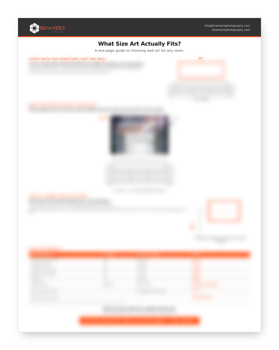
I put together a one-page Print Size Guide you can print out or keep on your phone and carry from wall to wall:
- The proportion rule designers use, with a lookup table matching your furniture width to the right print size
- A visual comparison showing what common sizes actually look like at real wall scale
- The correct hanging height — there’s a standard, and it’s lower than most people hang
- Which material suits which room, and why that decision changes with the light
It’s free. Add your email below and I’ll send it over.
Loved what you just read?
Become a VIP Insider and get more of the good stuff – exclusive tips, insider updates, behind-the-scenes stories, and special promotions delivered straight to your inbox.
Don’t miss out—our VIP members get the best of everything first

